
53 Actionable Conversion Rate Optimization Tips for Indian Businesses in 2026
In my previous post, I offered a high-level conversion rate optimization blueprint for Indian businesses. I promised to follow it up with an actionable checklist of conversion rate optimization tips. This post delivers on that promise.
There’s a reason why I’m emphasizing conversion rate optimization (CRO) so much, especially for Indian businesses. The number of internet users in India just hit 1.09 billion, out of which only 300 million consumers shop online. As if that’s not disappointing already, the average conversion rate in India hovers between 1.5% – 2%, a good percentage point below the global average of 2.86%. These numbers tell a story – a story of distrust between Indian consumers and the Indian ecommerce industry.
By merely increasing their conversion rates to global benchmark levels, Indian businesses can achieve a 50% to 100% bump in their revenues. Since this seemingly innocuous number has an overwhelming impact on revenues, every Indian business should obsess over improving it.
I know of some businesses that do, but their CRO strategy is usually derived from global-context checklists. Unsurprisingly, I keep seeing them lamenting the sub-optimal results they get. Indian consumer psychology, shopping behavior, trust factors, and their local technological constraints are vastly different from those of their global counterparts. So, I’ve created this exhaustive list of conversion rate optimization tips, specifically for Indian businesses targeting Indian consumers. And if you notice any overlap with my on-page SEO tips blog post, that’s not a coincidence. Search engines monitor what users like and rank your pages accordingly.
I’ve broken the tips into their various contexts to make it easy for you to skip directly to the sections most relevant to your business.
23 Ecommerce Conversion Rate Optimization Tips
Conversion rate optimization in the ecommerce industry is all about reducing friction, building trust, and cutting down service costs. And they’re all interrelated. Working on one often has a cascading effect on another. For instance, strong brand trust moves customers from COD deliveries to digital payments, thereby cutting down costs on COD logistics. Here are some of the proven conversion rate optimization tips for ecommerce businesses and D2C brands:
1. Checkout Should Default to UPI as the Primary Option
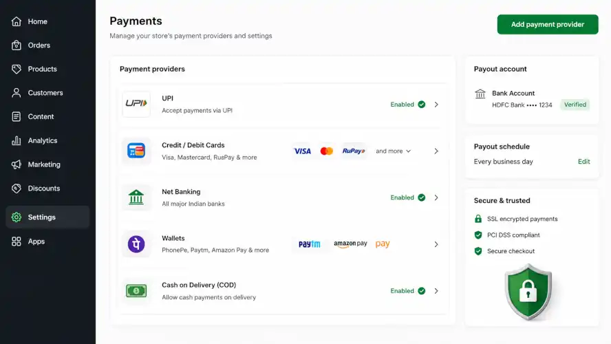
Razorpay estimates that 13% of customers abandon carts when their preferred payment method is not available. In India, that’s UPI.
Unified Payments Interface (UPI) has democratized transactions in India, and has become the default digital payment rail for most Indian transactions. Checkouts that default to card entry are patterns inherited from Western templates. And this puts friction in the purchase journey of online shoppers, costing businesses dearly in abandonments.
Lead with UPI/QR, and treat card entry as the secondary option.
2. Implement Auto-Detect UPI App Shortcuts for Single-click Checkouts on Mobile
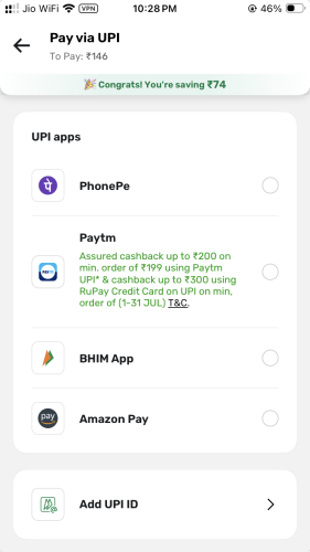
Configure your checkout system to dynamically detect installed UPI applications (such as Google Pay, PhonePe, or Paytm) on the shopper’s mobile device. This pre-selects the app and allows the user to complete their payment with a single click and an MPIN entry, eliminating the hassle of manually typing virtual payment addresses (VPAs).
Remember: the fewer steps shoppers take during purchases, the higher the conversion rate. So, reduce the steps to purchase completion every way you can.
3. Implement One-Click Checkout Layers (Shopflo or GoKwik)
Mobile-optimized one-click checkout layers, like those deployed by Shopflo or GoKwik, make card payments as seamless as UPI by storing users’ payment and profile details. They eliminate multiple points of friction and let users go straight from product page to final payment page swiftly. These are the kind of seamless journeys that’ll help improve conversion rates in India.
4. Don’t Hide or Bury the COD Option
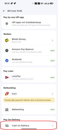
Forget credit card and UPI. About half of all online purchases in India are still COD, well into 2026. The reasons for this are plenty, including low trust in ecommerce as a shopping medium, caution from first-time buyers, perceived product or service quality risk, and so on.
Despite positive experiences, the shift from COD to digital payments remains slow, particularly in Tier-2 and Tier-3 cities. And that’s not going to change anytime soon.
Yes, COD comes with its own challenges like unusually high Return-to-Origin (RTO) rates, fraudulent orders, and delayed cash remittances. Still, businesses must treat them as new market access costs. COD continues to be the most powerful driver of adoption by first-time buyers.
5. Offer Pre-Payment Discounts to Shift COD Buyers
One way to fight the high costs of cash-on-delivery orders is to incentivize shoppers to shift to digital payments. A dynamic 10% to 15% discount for prepayments at the time of checkout can be just the lever you need to lift shoppers from COD to digital payments.
“Save ₹50 with UPI” framing converts better than a COD surcharge framed as a penalty. It’s the same economics, but very different psychology. With savings as an incentive, the customer is even left feeling happy for being money-savvy.
6. Surface EMI on the Product Page, Not Just at Checkout
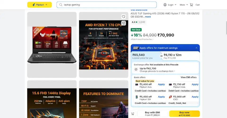
On higher-ticket items, an EMI badge next to the price changes how a buyer mentally frames the purchase before checkout even begins. Show something like “As low as ₹₹₹ /month” directly under the price for EMI-eligible items, rather than leaving financing options buried in a checkout-page icon row.
Flipkart is the undisputed king of reframing purchases. Just look at their product page for a gaming laptop. The listed price of ₹84,990 is discounted to ₹70,990. Further, card payments can fetch additional discounts of up to ₹5,450.
If that’s not a sufficient incentive, an EMI button at the bottom reframes the ₹70,990 product as a “₹7,888/m” purchase. They even made the EMI option a part of their WOW offer with the sweet-sounding ₹6,110 per month deal. They leave no stone unturned to help their shoppers reason out their purchases with themselves.
7. Reveal Total Cost Before the Final Step
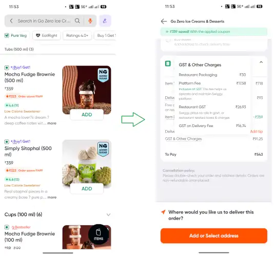
A shipping charge or COD handling fee that only appears on the last screen is one of the most common cart-abandonment triggers. And it vindicates the low trust Indian consumers already place on ecommerce entities. Yet, dark patterns like drip pricing are shockingly prevalent in the country.
A 2025 study by LocalCircles found drip pricing on 66% of the major ecommerce platforms in India, including Flipkart, Myntra, Cleartrip, MakeMyTrip, BigBasket, Netmeds, TATA 1mg, Zomato, Blinkit, and Ixigo. This is despite recent government warnings against such deceptive practices, possibly reinforcing consumer sentiment that they must fend off for themselves against ecommerce malpractices.
8. Implement Automatic Keyboards during Form Fills
To reiterate the importance of friction-less conversion journeys, your visitors must find it as easy as possible to complete desired actions, including form fills, whether it’s to access gated content or request demos. One way to make it happen is by configuring form fields to dynamically trigger the correct native keyboard. For instance, show numerical pads for phone numbers, PIN codes, and credit cards, and specialized keyboard layouts with “@” characters for email fields.
9. Restrict COD Availability for Flagged High-Risk Profiles
If a shopper has a history of rejecting COD deliveries across the merchant network, dynamically disable the COD payment option. Prompt them with a polite message indicating that only prepaid options are accepted for their location.
10. Implement Predictive COD Risk-Scoring at Checkout
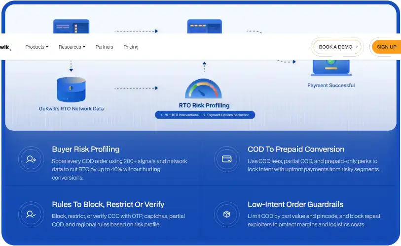
Failed COD deliveries are a major drain on profit margins. To protect your business, use risk-intelligence networks like GoKwik to analyze buyer behavior across hundreds of stores. This allows you to identify high-risk profiles at the point of checkout.
Put in place a framework for handling such high-risk profiles. Measures like temporarily disabling the COD payment option, additional conditions for returns processing, mandatory delivery proofs, etc. can be implemented to manage the risk posed by such profiles.
11. Deploy Address Verification APIs to Correct PIN Code Mistakes in Real Time
Indian shipping addresses are notoriously unreliable. Typos, formatting errors, landmark mistakes, and missing pieces of information are ridiculously common. Use real-time address validation APIs to automatically match entered PIN codes with the correct city and state, preventing costly shipping errors and delivery delays.
12. Capture Precise Location Data From Users
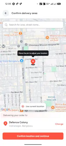
Instead of relying entirely on user-inputted shipping addresses, prompt the user to share their precise location with the “Share Location” feature. Since the overwhelming majority of web traffic in India originates on mobile, it’s time to leverage this.
Quick commerce companies like Blinkit, Swiggy Instamart, Zepto, and BigBasket already do this. So, consumers are already quite comfortable sharing their precise location.
13. Implement In-Line Field Validation with Immediate Visual Feedback
Prevent input errors by using real-time inline validation. Showing a simple green checkmark when a PIN code or phone number is entered correctly, or providing a helpful hint for formatting errors, reduces user frustration.
When validating addresses, note that there’s a huge gulf between urban areas and rural areas in India. While some urban centers are well-mapped, with addresses easy to validate, rural areas continue to be wildly non-geocodable.
14. Use Progress Indicators and Bars on Multi-Step Funnels
Process opacity is a major trigger for cart abandonments. Customers want to know how long this entire exercise is going to take. If they can estimate it, they get anxious and often drop off.
If your registration process requires multiple steps, implement a visual progress bar. Visually breaking down the steps and displaying “Step 1 of 3” reduces customer anxiety and encourages them to complete the process.
15. Visually Group High-Performing Products into Bundle Saving Paths
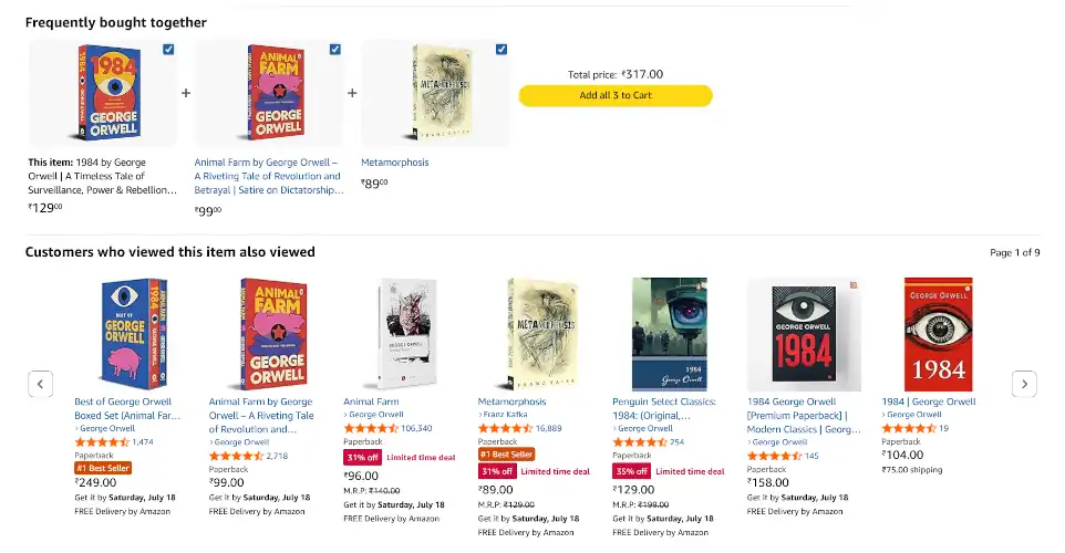
Instead of displaying generic product lists, curate logical bundle recommendations, such as “Frequently Bought Together” kits. Feature clear discount incentives for buying the complete kit to grow average order value (AOV).
Almost all online retailers do it these days with varying degrees of effectiveness. Amazon pioneered this feature, riding on their exceptional analytics. But this feature has become a staple of modern ecommerce. So much so that third-party plugins and tools exist for different shopping platforms. Rebuy, Wiser, Quizify, Nosto, Dynamic Yield, and Vertex AI Search for Commerce are some of the more popular options.
16. Enable Guest Checkout Defaults
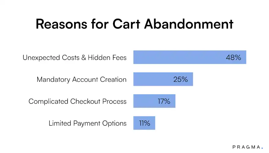
The second biggest reason for cart abandonment in India? Forced account creation!
Never force registration before a purchase. Creating mandatory account fields adds massive friction. Offer a clear, default “Checkout as Guest” path, allowing shoppers to complete their purchase first and inviting them to save details on the order confirmation screen.
17. Provide Detailed Real-Time Tracking Transparency
Subconscious anxiety during shipping causes “already converted” customers to buy from competitors or reject COD packages at the door. Send automated transactional SMS or WhatsApp alerts with direct, clickable tracking links as the product makes its way to their doorstep.
18. Display Star Ratings and Review Counts Prominently
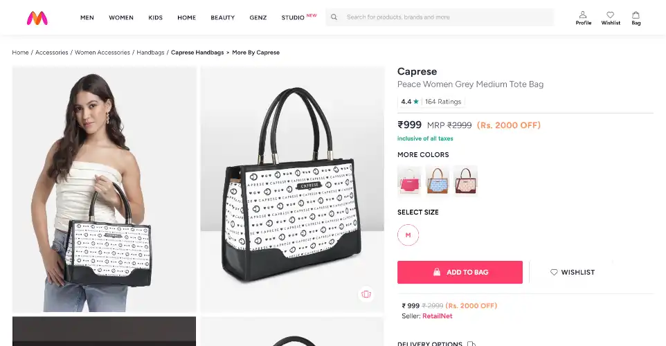
Skeptical shoppers rely heavily on customer feedback before buying. Display average clickable star ratings and the total number of reviews immediately beneath your product titles above the fold to build instant credibility.
You have full control over almost every piece of information on your website – product specs, descriptions, features, and so on. Naturally, your potential customers are understandably skeptical about those claims. What they need is reliable information that you cannot control completely.
Customer reviews and ratings are precisely that, and that’s why they work. Skeptical shoppers rely heavily on customer feedback before buying. Display average clickable star ratings and the total number of reviews immediately beneath your product titles above the fold to build instant credibility.
19. Embed Authentic Video Reviews and UGC

Building on the previous tip, many online retailers have begun embedding video reviews and user-generated content (UGC) right into their product pages. They are much more effective than your premium studio images.
Visual content does the heavy lifting when shoppers cannot physically interact with products. Replace polished studio images with raw user-generated content (UGC), photo reviews, and unboxing videos positioned close to your “Add to Cart” button.
20. Optimize Landing Pages for Regional Voice Queries
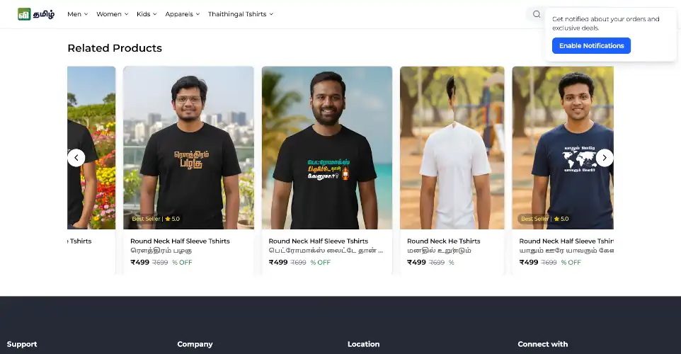
9 out of 10 new internet users are estimated to use Indian languages for accessing the internet. Over 50% of all content viewed on Google Discover in the country is served in Indian languages. These are insane numbers.
Optimizing your content only for English-speaking audiences, or even focusing on the English-Hindi dual setup, is ignoring the vast majority of Indian internet users.
It’s not enough that you serve them content in local languages. Depending on who your audiences are, you might have to incorporate colloquialism into your content, at least for SEO purposes, even if it’s not prominently displayed. For instance, Clutch becomes Kalach (कलच) in Hindi, Sweater becomes Koti (ਕੋਟੀ) in Punjabi, Powder becomes Poudru (ಪೌಡ್ರು) in Kannada, and so on.
21. Recover Abandoned Carts Over WhatsApp, Not Just Email
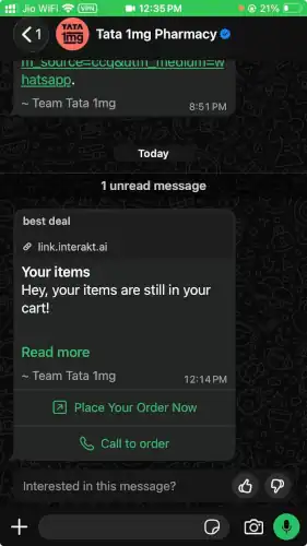
India is a WhatsApp-first country. Emails are not the preferred communication channel, even for B2B clients.
In fact, cart-abandonment emails have meaningfully lower open rates than WhatsApp messages for a lot of SME audiences. That’s a channel-fit issue, not a copywriting issue. With consent, add a WhatsApp Business API nudge alongside your email recovery flow, not instead of it.
In fact, many email marketing tools in India today offer omnichannel campaign setup that combines email, WhatsApp, and SMS channels.
22. Replace Generic Urgency With Specific, Honest Urgency
A countdown timer that resets every time a visitor reloads the page is highly effective, but only once. The next time your visitor sees it happening, they’re instantly disgusted by the dark pattern and may even avoid you with vengeance. It erodes trust fast, especially with an audience that’s increasingly familiar with dark patterns on ecommerce platforms.
Use real stock counts or a real festive-offer end date instead of an evergreen fake timer. Indian ecommerce platforms routinely field big sale events every month, if not several times a month. Payday sales, season-end sales, match-day sales during IPL, festive sales – there’s no dearth of ideas in a country where there’s always a festival right around the corner. We love them.
7 SaaS and Tech Conversion Rate Optimization Tips
In the enterprise software, SaaS, and IT services domain, conversions are tricky. A purchase or a subscription isn’t always a definite conversion. Prospective clients often browse, test, look around, experiment with features, and test the product or service thoroughly before committing. If you’d like them to stay with you after the free trial or even a month of paid subscription, you must invest heavily into understanding what they want, and why they’re quitting. These conversion optimization tips will help you make it happen:
1. Highlight Best-Value Options with a “Most Popular” Badge
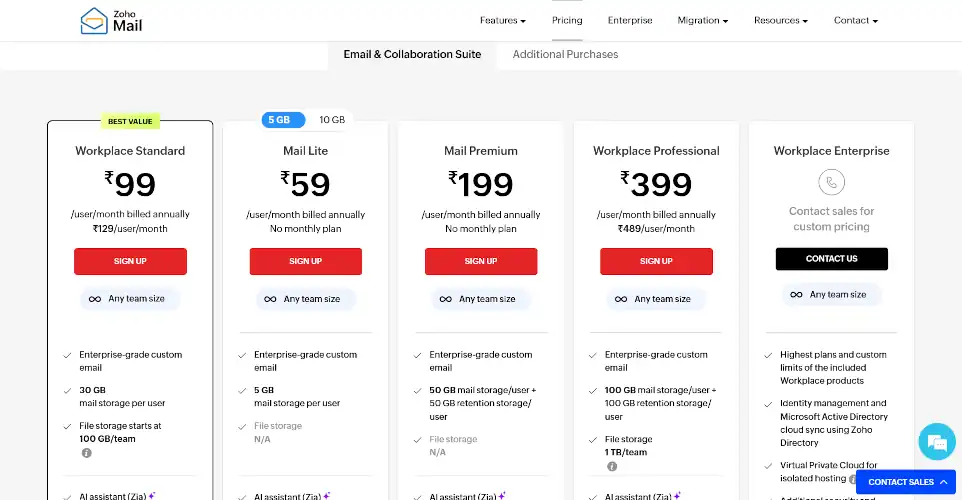
When displaying software pricing tiers or product bundles, help potential customers make decisions faster by visually highlighting a single plan. Use a contrasting “Most Popular” or “Best Value” banner on your target tier to manage choice anxiety.
Some of the badges that I have found to be exceptionally helpful in making purchases include, “Lowest Price in 365 Days,” “Lowest Price Since Launch,” “X People Purchased this Product in the Last 30 Days,” and “This Product Has Low Return Rate.”
Each of these badges offers a specific piece of information that quashes an internal obstacle in the buyer’s mind, and prompts them towards a purchase.
2. Find and Target the Right Audience
Overzealous SaaS founders often target broad audiences, under the wrong impression that their solution is the answer to all problems that matter to them.
Too often, high abandonment rates in the SaaS industry aren’t because of issues with the product itself; it could be because of your marketing strategy that’s pulling the wrong crowd.
Find earlyvangelists and really dig into who they are and why they like your solution. That should offer insights about whom to target. Remember: huge traffic volumes and even initial signups mean nothing if they’re the wrong kind. They’ll not necessarily convert. So, it’s crucial that you track actionable metrics like product activation rate, free-to-paid conversion, and 30-day cohort retention instead of vanity metrics like gross website visits and cumulative free trial signups
3. Design Dedicated, High-Intent Comparison Pages
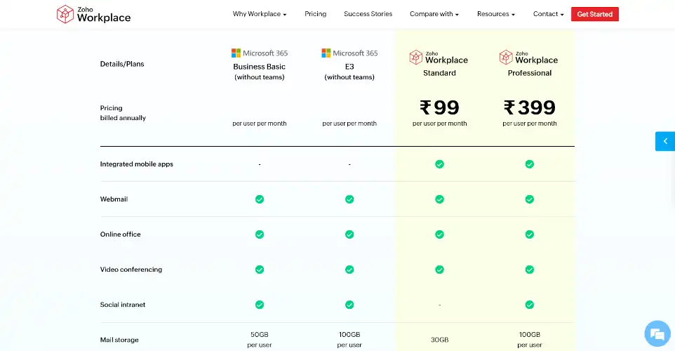
Enterprise buyers spend a significant portion of their journey comparing alternatives. Your competitors and third-party blogs are likely already tapping into this need by creating in-depth comparison content. Don’t let them steal the attention from you.
Create side-by-side “us vs. them” matrices (e.g., “Our Tool vs. Competitor”) to keep comparison traffic on your domain rather than third-party review sites.
4. Incorporate Conversational AI and Live Chat
High-value B2B prospects value their time too much to wait days for a sales representative to call. Integrate a behavior-triggered AI chatbot to offer real-time product answers and schedule instant, self-service demo pathways.
Of course, that means training AI chatbots with your company-specific data, which requires you to create an extensive knowledge base to begin with. It’s an investment that will save a great deal of your sales team’s time, while drastically boosting conversions.
5. Optimize Your Pricing Page Structure
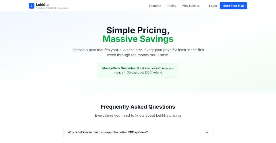
The pricing page is the highest-intent page on a SaaS site. Visually highlight the most popular plan, offer a clear, zero-risk free trial path, and include a concise FAQ section that answers common technical objections before they become purchase blockers.
Anticipate any reasons that could prevent your audience from making the purchase and address them on this page:
- Worried about service quality? A “30-day money-back guarantee” is just the trick you need to convert even the most stubborn visitors.
- Want to test the waters before committing? A free plan or a free trial is all it takes.
- Don’t wish to make a long-term commitment? Offer monthly or quarterly plans, alongside annual plans.
- Hate dependencies? Offer easy migration to and from your platform.
6. Give Quick, Localized Access to Customer Support
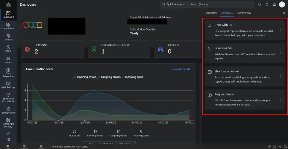
Show your prospective customers that help is easily available and accessible by prominently displaying multiple customer support options. More importantly, implement localized support wherever possible.
Not everyone can communicate in English or Hindi. Yes, I know these are B2B clients, but that doesn’t mean the people in their employ are always comfortable with the two languages. Support in local languages can go a long way in building trust, and eventually becomes a sticky feature that retains disgruntled customers too.
Zoho, for instance, offers customer support via Live Chat, Phone Call, and Email Options. They even have a dedicated team for Demo support. The availability of local support options is a major draw for their B2B clients in India.
7. Feature Verified Named Testimonials with Face Photos
Testimonials go a long way in winning over trust when you’re targeting a specific industry. Seeing a familiar name (could be a company or person) vouching for you is the most powerful trust factor you can display on your website. So, whenever you land a prominent client, try to earn their testimonial. If you can get a video testimonial, that’s worth its weight in gold.
Avoid generic, anonymous quotes. Display customer testimonials featuring full names, job titles, face photos, and specific results (e.g., “reduced drop-offs by 22%” instead of “great service”), adding authoritativeness that builds trust.
8. Set Up Demo Content and Training Videos
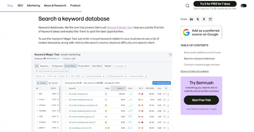
Listing out features and benefits on your website is one thing. Whether the tool really performs the way it’s advertised, is a question that isn’t easily answered.
Demo videos that demonstrate your tool’s features in action are always an instant hit. They not only show how capable the tool is, but also offer tutorials for new users.
Interestingly, such content has a powerful impact on SEO too. Few businesses do this better than SEMrush.
5 FinTech and Financial Services Conversion Rate Optimization Tips
Fintech and financial services industry makes its customers anxious. The stakes are high, with long-term impact on consumers’ lives. So, businesses must go the extra mile to earn a higher conversion rate by showcasing their trustworthiness, unblemished track records, and secure systems they’ve put in place. These conversion rate optimization tips will help you do precisely that:
1. Display Prominent Regulatory and Compliance Markers
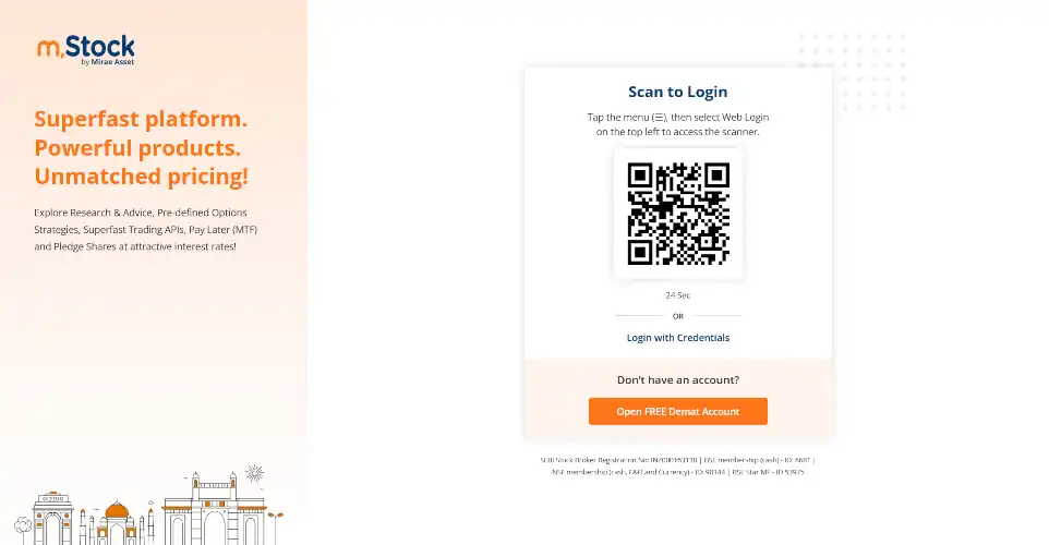
Sharing personal data like Aadhaar or PAN numbers creates immediate psychological friction. Place official regulatory badges, such as “RBI-Regulated NBFC Partner” or security validation locks, prominently on your landing pages and near sensitive form fields.
When asking for Aadhaar details, let users choose between sharing their actual Aadhaar Number and Virtual ID. Integrating Digilocker into the flow can be another powerful indicator of trustworthiness.
2. Implement In-Line Form Field Validation
Do not wait for a user to hit “Submit” before showing errors. Use real-time in-line validation to provide immediate visual feedback (e.g., a green checkmark for a valid input or helpful hints for formatting errors), which can lift form conversions significantly.
3. Use Visual Progress Bars on Multi-Step Applications
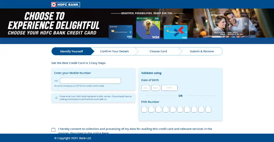
Long, endless forms are major conversion killers. Divide your applications into a multi-step interactive setup, using a visual progress indicator (such as “Step 1 of 3”) to reduce user anxiety and build transactional momentum.
4. Ensure Proper Local Tax Compliance (GST Invoicing)
If your financial tool bills business entities, make sure your accounting setup natively generates compliant tax e-invoices featuring the client’s GSTIN. Lost input tax credits from non-compliant international billing systems are a major driver of subscription cancellations.
Small businesses may not always have a GSTIN. So, consider making it an optional feature, depending on whether your clients might include some without one.
5. Display Real-Time Interactive Calculators
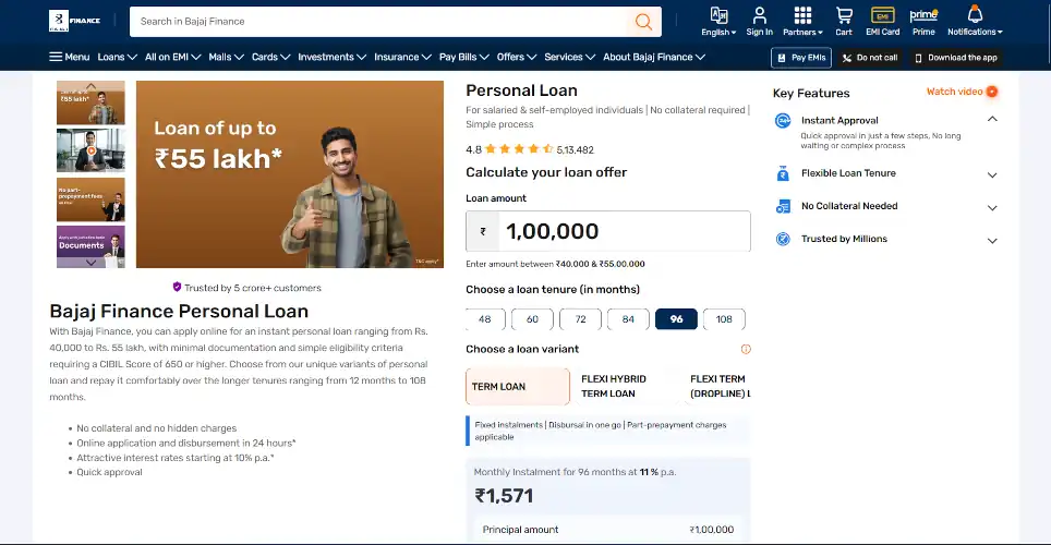
Allow users to calculate returns or premium estimations on your landing pages. Let them see estimated benefits dynamically (such as monthly premium rates or expected maturity yields) to capture their interest before asking them to register.
5 High-Ticket Lead Gen and Real Estate Industry Conversion Rate Optimization Tips
When your audiences are HNIs, enterprise customers, and high-value equipment buyers, the sales journey can last several months. And it begins with lead gen – a form fill, a call, an office visit, or any other first contact. So, the conversion that matters most in such contexts is capturing “qualified” prospects. Implement these conversion optimization tips in such contexts to witness a higher conversion rate:
1. Integrate Direct WhatsApp Messaging CTAs

Mobile users in India hate form fills, even if it’s for something as simple as placing a callback request. And the traditional email capture forms go summarily ignored altogether.
Placing a floating, secondary CTA button like “Chat with our Expert on WhatsApp” allows leads to engage instantly on their preferred messaging application, matching their natural conversational habits.
This way, you get a lead, and your prospective clients don’t even have to wait long to speak to you.
2. Align Ad Headlines with Landing Page Messaging
Prevent immediate user exits by matching your incoming traffic source copy with your on-page titles. If an ad promises an exclusive “Gurugram Launch Pricing,” ensure that exact phrasing is mirrored in your landing page’s above-the-fold header. Otherwise, you’ll have a high bounce rate on your hands to deal with.
In fact, make this a core element of your digital marketing strategy. Whether your visitors come from organic sources or inorganic ones, the landing page content greeting them should strongly complement, if not match, the exact content they click on to arrive there.
Facebook, for instance, already enforces a policy of consistency between the content on its platform ads and advertiser landing pages. It’s not just a compliance policy. It is a tremendous trust factor, too.
3. Leverage Dynamic Location-Based Personalization
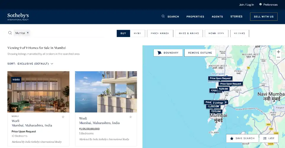
Static landing pages fail to build personal relevance. Use IP or geographic personalization to dynamically adapt your headlines and pricing grids based on the visitor’s city (e.g., showing local luxury properties or region-specific service plans), which can lift customer acquisitions.
4. Deploy Behavior-Triggered Exit-Intent Offers
Capture leaving prospects by triggering a highly focused, visual popup as their cursor moves toward the close button or when they hit “back” on mobile. Offer a valuable, free, downloadable resource (such as an actionable checklist, market report, or even high-value generative AI prompts) in exchange for their email.
Of course, that also means you’ll have to spend some time figuring out what type of downloadable resource your audience genuinely values. So, that might require some research and A/B testing.
5. Track Phone Calls as a Primary Macro-Conversion
For regional offline businesses, a phone call is the highest-value conversion signal. Make your corporate numbers click-to-call on mobile screens, and set up event tracking to measure how many clicks turn into active telephone discussions.
13 Essential Conversion Rate Optimization Best Practices for 2026
A conversion isn’t always a sale. It can be any desired action, such as a form submission, social share, phone call, newsletter signup, or something else that your business values. Therefore, it’s not always e-commerce companies that need to worry about it. Every business with a digital presence must make a robust CRO strategy a core element of their digital growth strategy.
The following conversion optimization tips apply to the vast majority of businesses with a digital presence, irrespective of whether they sell online or not. These CRO tips will improve your SEO posture, user experience, and ultimately, your search engine visibility.
1. Lead With a Value Proposition. No Nonsense
Keep above-the-fold messaging simple and clear. Within three seconds of landing on your page, a user must understand exactly what your brand offers, why they should care, and why they should trust you. Use plain, benefit-driven language rather than vague, feature-heavy jargon.
A headline like “We are a leading provider of X” spends that window saying nothing. Replace “About Us” framing with an outcome-focused headline. Think, “What does the visitor get? And how fast?”
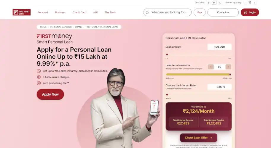
Check out this landing page by IDFC First Bank. It answers every major question a visitor has regarding their personal loan product, such as loan amount, interest rate, foreclosure charges, processing fee, etc. They even put the calculator right there for easy EMI calculations.
There are no major missing pieces left for the visitor to fill through more research or a call to the bank. They have few reasons left to not apply for the loan.
2. Cut Form Fields to Bare Essentials
Every additional form field measurably reduces completion. For instance, abandonment rates are 6.4% for email and 6.3% for phone numbers. It’s one of the most consistently validated findings in CRO that more form fields mean more abandonments.
For lead-gen forms, ask for name and phone number, not email. Indian buyers are phone-first. Email is often an afterthought address they barely check.
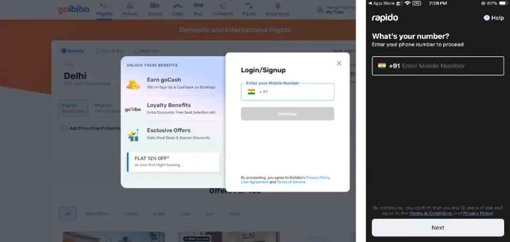
Many Indian online businesses, like Goibibo and Rapido, exclusively use phone number as the primary contact information during signup, with other details being secondary.
Far from having an adverse impact on user experience, it actually improves it. Not to mention the elimination of spammy signups using disposable emails.
3. Design for Mobile. Don’t Treat it as an Afterthought.
Even today, most web developers design websites for desktops, and make them responsive for mobile. In a country where 72% of all web traffic comes from mobile, that’s called being out of touch with the ground reality.
Indian websites must be designed for mobile first, with desktop being an adaptation. Priority should be given to mobile-first design elements and user experience, which is great for search engine optimization too.
4. Compress Images into Next-Generation WebP/AVIF Formats
5G penetration continues to be spotty, even in urban hubs across the country. And where it’s available, only 250 million subscribers currently use it, according to the Government of India. Clearly, it’s far from being the default wireless tech for Indian users.
For those on unreliable 4G connections, it’s critical that webpages load quickly. Heavy images are a primary driver of page weight, which directly slows down mobile loading times.
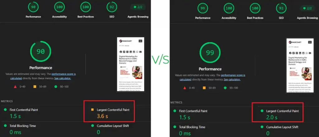
By compressing and converting traditional JPEG or PNG images into next-generation WebP or AVIF formats, you can reduce visual file sizes by 30% to 50% without sacrificing picture quality, directly speeding up your site for mobile users.
For instance, we compared the page load speeds of one of our recent blogs using PNG and WebP images. The results were as expected. The PNG image version blog’s Largest Contentful Paint (LCP) loading time was 80% longer than the WebP image version.
5. Use Localized Content Delivery Networks (CDNs) with Indian Edge Servers
Ensure your static assets are delivered instantly to regional audiences by utilizing a Content Delivery Network (CDN) with domestic edge servers in India, such as Cloudflare, Fastly, or AWS CloudFront. This minimizes data travel distances, keeping server response times exceptionally fast. Amazon CloudFront is generally the best for e-commerce businesses. For small businesses with low traffic volumes, Cloudflare is an ideal solution, thanks to its easy and simple setup.
6. Push Images Below the Fold Whenever Possible
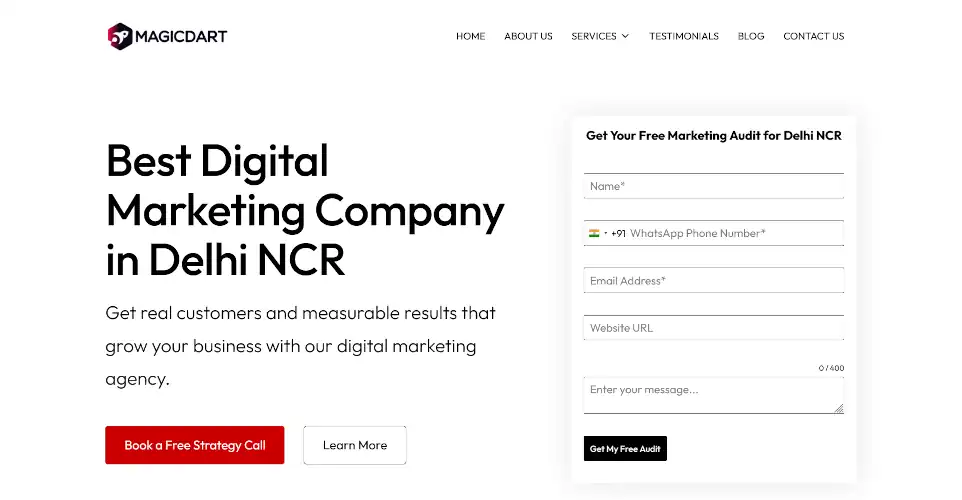
One powerful way we improve page load speeds at MagicDart is by pushing images below the fold. For above the fold, we minimize animations, complex graphics, and just about anything besides plain text. Even the forms we use are simple and optimized for fast loading.
7. Compress and Lazy-load Every Image
If you think about it, there’s absolutely no reason for the entire page to load at once. People take time to scroll, so you can stagger page loading, in theory. In practice, however, you don’t have to do it to the entire page. You just have to lazy-load images, since they are usually the heaviest elements on webpages.
Configure images below the fold to lazy load, meaning they only render as the user scrolls down the page. This prevents the browser from loading non-visible assets upfront, which reduces initial load times. This drastically improves user experience.
8. Defer Render-Blocking JavaScript and Minify Code CSS/HTML
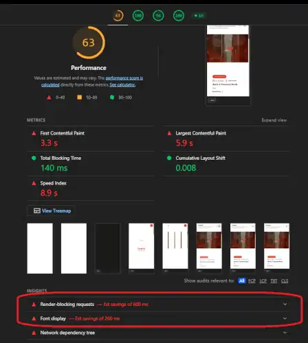
Remove code bloat from your website by minifying and bundling backend files. Delivering CSS inline for critical rendering paths and deferring non-essential JavaScript prevents scripts from stalling browser parsing, allowing visitors to view and interact with your content faster.
This is not as complex as it sounds. For WordPress, plugins like WP Rocket, LiteSpeed Cache, W3 Total Cache, and so on exist to make this task easy.
Even for custom-built websites, the whole thing hardly takes about 30 minutes or so.
9. Give Every Page One Primary Call-To-Action, and Make it Sticky.
Every webpage should have a singular purpose – one overarching conversion goal. And it should be pursued with a single, coherent, and precise CTA. Whether it’s “Buy Now,” “Learn More,” “Download Brochure,” or something else, keep it consistent.
Multiple CTAs split visitor intent and quietly reduce the conversion rate of the entire webpage. So, do not confuse your visitors with multiple CTAs.
At the very least, pick one primary action per page and make secondary actions visually and functionally smaller: text links, not buttons.
Also, sticky CTAs should follow your visitors as they scroll through the page. Specifically, Indian consumers strongly engage with “Call Now” and “WhatsApp Us” buttons. So, use them instead of something generic like, “Contact Us.”
10. Let Data Override Subjectivity with Heatmaps and Session Replays
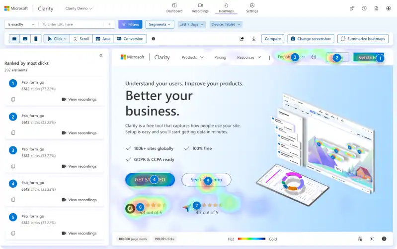
Never make visual updates based solely on a gut feeling, even if it’s based on “decades of experience” and deep insights into your audience.
Use analytics tools like Hotjar or Microsoft Clarity (it’s free) to analyze real-world scroll maps, click maps, and session recordings to locate and fix actual user bottlenecks.
As part of your conversion rate optimization strategy, look for ways to set up data collection mechanisms to track what’s working, and what’s not. It’s a constant process, since user behavior, needs, wants, and consumer preferences evolve rapidly in the digital space these days.
11. Set Up Real GA4 Funnel Tracking Before Running Any Test
Without a working funnel view, you’re optimizing on guesswork. And, most SME GA4 setups are still tracking pageviews only, not an actual conversion funnel. Define your real funnel steps inside Google Analytics 4 (product view >> add to cart >> checkout start >> purchase, or the service-site equivalent) rather than relying on default pageview events alone.
12. Run A/B Tests With a Focus on Statistical Significance
You must have sufficient experimental data to derive accurate insights from it, and that means running A/B tests across a broad timeline. For instance, your split and multivariate testing must run for at least two full business weeks. This duration ensures the experiment captures complete weekday and weekend traffic patterns.
Also, to ensure A/B testing accuracy, isolate your variables. Changing your headline, button color, and image layouts simultaneously makes it impossible to analyze which variable actually caused a change in performance.
To ensure that your tests produce statistically significant results, keep variables to a minimum and collect as much data as possible.
13. Run Separate Experiments for Mobile vs. Desktop
Because user behavior and conversion environments differ radically between mobile and desktop devices, running unified tests can distort your results. Always segment your traffic and analyze your variant performance separately by device.
Final Thoughts: Implement the Testing Loop
At the end of the day, conversion rate optimization is a continuous, data-driven cycle of improvement. To transform your website traffic from mere numbers on analytics dashboards into hard cash flows, avoid making changes to your digital assets based on gut feelings or subjective team design opinions. Instead, rely on diagnostic tools to observe real-world user behavior. Use scroll maps, click heatmaps, and session recordings to locate actual drop-off barriers.
Once your team has isolated a bottleneck, formulate a clear hypothesis, prioritize it using a structured framework, and run your split-tests for a minimum of two full business weeks to ensure your changes deliver real, measurable commercial value.
Your CRO effort is not complete after the optimization tasks are complete. Effective CRO entails monitoring the funnels 24/7/365 to be vigilant for any signs of unusual friction, and to address emerging challenges quickly. In other words, conversion rate optimization is a full-time job requiring relentless effort.

Leave a Reply